3.3. Visualizer
The Visualizer allows users to view previously saved results and compare multiple EBSEM, One-line, and Hybrid simulations, supporting a streamlined side-by-side analysis of different models. By adding multiple model simulations, users can evaluate their performance using various comparison metrics, such as accuracy and fit. This feature provides a unified interface for visually comparing the outputs of different models, helping users identify trends and differences. Additionally, users can save or export the visualized results for further analysis or documentation. Figure 3.3.1 Shows the Inforgraphic of the Visualizer Module to ilustrate the workflow of this module.
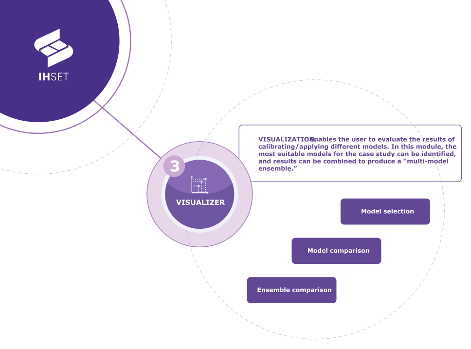 Fig. 3-3-1. Visualizer Infogram to ilustrate the workflow process in the Visualizer Module
The following explains how to use the Visualizer feature in more detail.
3.3.1. Procedure
The model Visualizer is a feature designed to allow users to perform side-by-side comparisons of multiple simulations by transect. The Visualizer contains a list of previously run and saved model simulations from the EBSEM, One-line, and Hybrid models. Please note that only simulations that have been stored in an output NetCDF file are available for selection and comparison.
The following describes the procedure for the Visualizer. The figure below illustrates the start screen for comparing multiple model simulations.
Adding Models: Click on Browse File to select the output NetCDF file and add previously saved model results to the Simulation List.
Viewing Visualizer Results: Select whether to view Cross-shore or Rotation simulations, and then select the transect to view based on the model results uploaded. Note that Cross-shore and Rotation results will be shown for the One-line and Hybrid models across all transects, while the EBSEM models will only be available in their respective category for the transects simulated.
Comparing Models: Add additional simulations using the Browse File button and toggle them on or off using the check box on to the left of each model name in the Simulation List.
Viewing Model Summary: Click the arrow next to the model name in the Simulation List for a drop-down summary of the simulation’s characteristics.
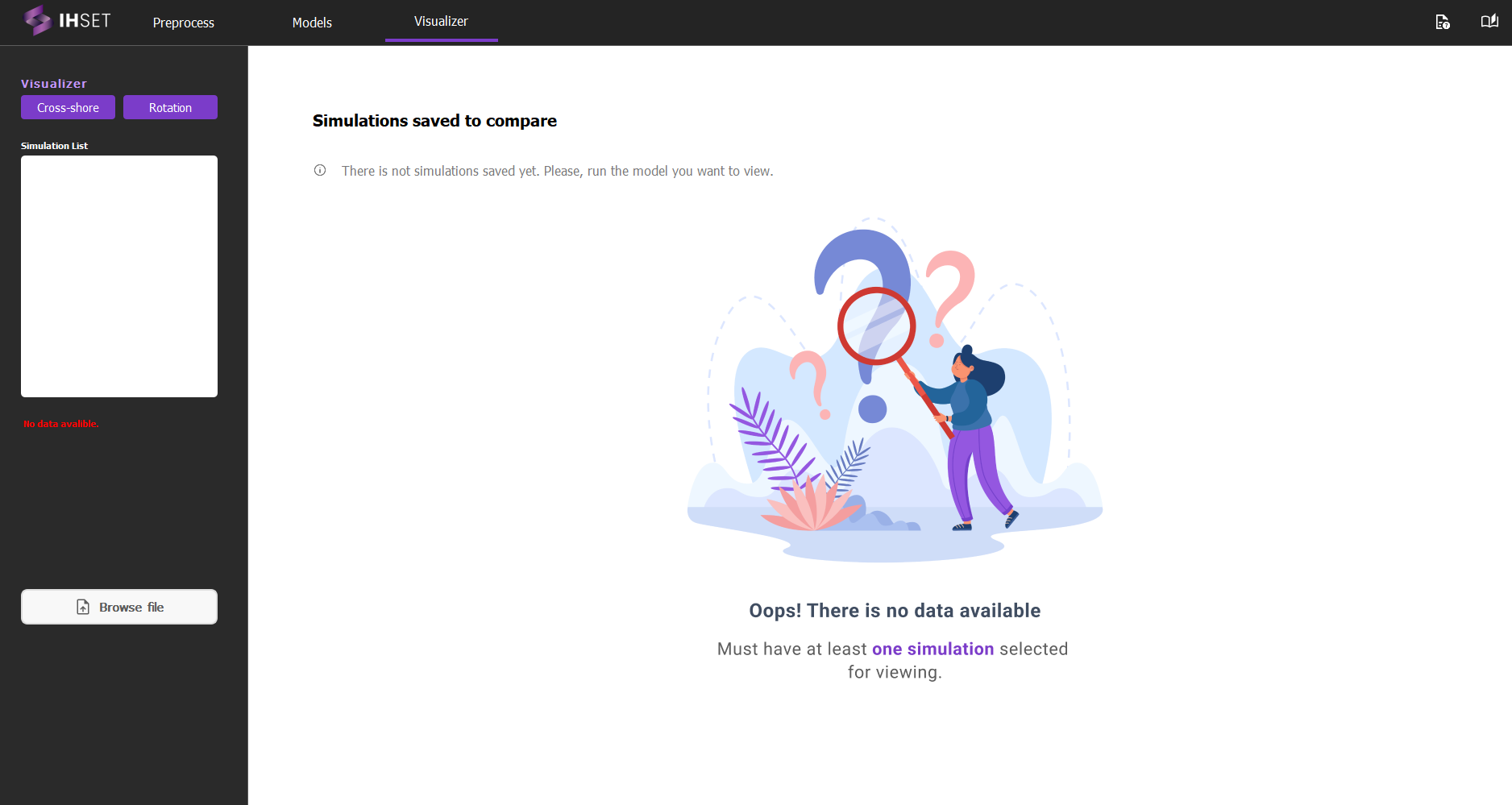 Fig. 3-3-1-1. Visualizer start screen for comparing multiple EBSEMs.
3.3.2. Results
After initiating a visualization, the Visualizer results window appears, displaying only the comparative graphs for the selected models (Fig. 3-3-2-1). A left-hand panel is available, allowing users to toggle each model on or off to customize which model results are actively displayed in the comparison graphs. This provides flexibility in focusing on specific models or adjusting the comparison set dynamically without rerunning the analysis, making side-by-side analysis of multiple models more convenient and tailored to the user’s specific needs.
In addition to the simulation results, the Visualizer tool plots the average of the selected simulations (\(Ensemble\)). The difference between the ensemble and furthest result at each datetime (\(Ensemble_{Mix-Max}\)) is also highlighted in red.
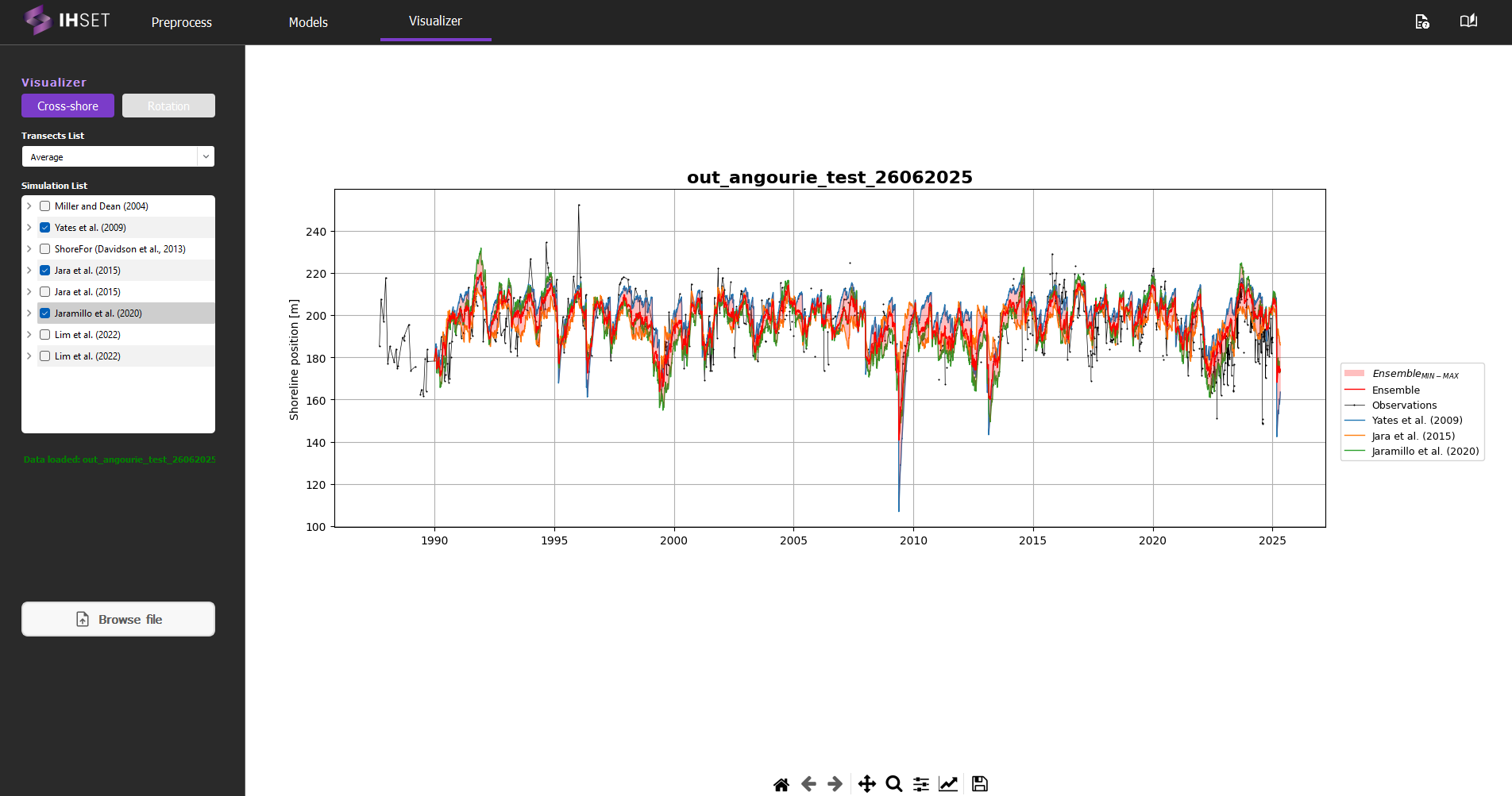
Fig. 3-3-1-2. Main screen displaying Visualizer results for selected EBSEM models.
Results can be saved as an image for further analysis and documentation using the Save File icon at the bottom of the Visualizer view window. The other icons located here allow the user to adjust the plot view and attributes for a more personalized visualization.